All the questions in this post are official ones sourced from The College Board's question of the day app. The dates referred to in this post will be different if you have a newer version of the app. However, the app just cycles through the same questions, so everything in this post will still be relevant to you. You just won't be able to track down questions according to their date.
1. Remainder Theorem (December 4th, 2015)
A polynomial function \(f\) has \(x + 8\) as a factor. Which of the following must be true about the function \(f\)?
I. \(f(0) = 8\)
II. \(f(8) = 0\)
III. \(f(-8) = 0\)
B) II only
C) III only
D) II and III only
Since \(x + 8\) is a factor of \(f\), the remainder must be 0 when \(f\) is divided by \(x + 8\). Now the remainder theorem states that when a polynomial (e.g. \(f(x) = x^3 + 2x^2 - 3\)) is divided by a monomial such as \(x + 8\), the remainder is equal to \(f(-8)\). Therefore, \(f(-8) = 0\).
The other options aren't necessarily true and can't be proven with just the information given.
The answer is C.
If this is completely new to you, I highly recommend that you read up on synthetic division and the remainder theorem. I cover both topics extensively in my math guide.
2. Scatterplots (December 6th, 2015)

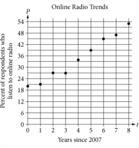
Each year from 2007 to 2015, a group of people were selected at random and surveyed about their use of online radio. The survey asked respondents whether or not they listened to online radio in the last month. The scatterplot shown gives the results of the survey, where \(P\) represents the percent of respondents who reported listening to online radio and \(t\) represents years since 2007. Which of the following equations best models the relationship between \(t\) and \(P\)?
A) \(P = 0.23t + 18\)B) \(P = t + 20\)
C) \(P = 2.3t + 20\)
D) \(P = 4.3t + 18\)
If you haven't worked with scatterplots before, it's simple. Each dot represents a data point. For example, in 2015 (8 years since 2007), the percent of respondents who listen to online radio was 53 percent.
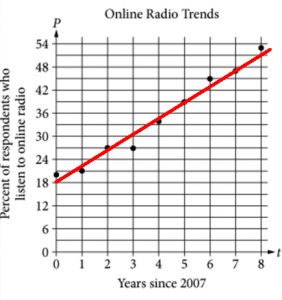
The question is asking for the equation of the line of best fit, which is the line that most closely follows the points as a whole. The SAT will never ask you to find the exact line of best fit. We can make a pretty good guess at it ourselves by drawing in our own line of best fit.

Let's find the equation of our line. We can do so by using two points on our line. The points \((5, 39)\) and \((8,51)\) look like easy points to work with. The slope between these points is
\[\dfrac{y_2 - y_1}{x_2 - x_1} = \dfrac{51 - 39}{8 - 5} = 4\]Now we can use point-slope form to find the equation of the line:
\[y - y_1 = m(x - x_1)\] \[y - 39 = 4(x - 5)\] \[y - 39 = 4x - 20\] \[y = 4x + 19\]In the context of this problem, this equation should be expressed as \(P = 4t + 19\).
The closest answer choice to our equation is D.
3. Experimental Design (January 19th, 2016)
A restaurant chain with 8 locations wants to introduce healthier options to its menu. In order to determine customer preferences, the chain will offer three new healthy options for a two-week period at all of its locations and analyze the percent of total orders that include at least one of the new healthy options. Which of the following research designs is most likely to produce valid results?
A) Recording how many customers ordered each of the new options at all of the restaurants over the two-week periodB) Asking a random sample of customers at all of the restaurants which new item they might order in the future
C) Recording how many customers ordered each of the new options at one of the restaurants over the two-week period
D) Recording how many customers ordered each of the new options for breakfast at all of the restaurants over the two-week period
In statistical experiments or studies, you want to keep the goal in mind. It's important to perform the study in a way that gives you the most accurate data possible as it relates to the goal.
The goal in this question is to see which of the new healthy options the restaurant's customers prefer. Now if you think about it, the most accurate data would come from a study that
- samples all the customers, not just a segment
- runs for a long time
- is conducted at all the restaurants
Answer B is wrong because what customers say is very often not reflective of what they do. Answer C is wrong because it focuses only on one restaurant. Answer D is wrong because it restricts the study to the restaurant's breakfast customers, who are not necessarily representative of all the restaurant's customers.
The answer is A.
4. Interpreting the Vertex (February 10th, 2016)

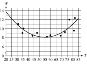
The scatterplot above relates a certain household's daily electricity usage, \(W\), in kilowatt-hours (kWh), to the average temperature for that day (24-hour period). A quadratic function that best fits the data is modeled in the graph above. Given that \(T\) represents the average temperature for a specific day, in degrees Fahrenheit (\(^\circ\)F), which of the following is the best interpretation of the vertex of the best fit curve in this situation?
A) The household uses approximately 14kWh of electricity on a day when the average temperature is 0\(^\circ\)F.B) The household uses about 22kWh of electricity on a day when the average temperature is 0\(^\circ\)F.
C) The least amount of electricity used by the household on a specific day is 55kWh.
D) The least amount of electricity used on a specific day when the average temperature is 55\(^\circ\)F.
Think of the vertex of a quadratic as the "midpoint"—the graph is symmetrical on either side of it.
The vertex also designates the maximum or the minimum of a quadratic. Because the graph is U-shaped in this question, the vertex designates the minimum.
From the graph, we can estimate the vertex to be \((55,8)\).
This means the household uses the least amount of electricity (8 kWh) when the average temperature for the day is 55\(^\circ\)F.
The answer is D.
Note that answers (A) and (B) are wrong because they deal with the \(y\)-intercept, not the vertex.
